
Littlebitsoflaw: Designing A Billboard That Works
A lot of legal advertising looks like they are designed decades ago. Stiff suits, intimidating fonts, and messaging that makes you feel like you need a degree just to understand the advert. When we designed this billboard for Littlebitsoflaw, we threw all of that out the window.
The Brief: Make wills about life, not death
Here's the thing about wills: nobody likes to think about them. They're associated with all the stuff we'd rather not dwell on whilst we're trying to get the kids to school or rushing to catch a train. Our objective was simple but ambitious: make this process feel like something positive you do for the people you love, not a chore you keep putting off.
Our Process: Finding the human story
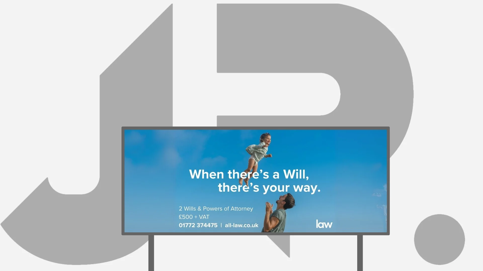
We started by asking ourselves: what does a will actually represent? It's not about death; it's about protecting your family's future. It's about making sure your loved ones are looked after. That insight led us to the image you see: a father catching his daughter. It's pure joy, trust, and protection all rolled into one moment. No gavels, no dusty law books, no stern-looking people in pinstripe suits. Just a dad and his little girl having the best day ever.
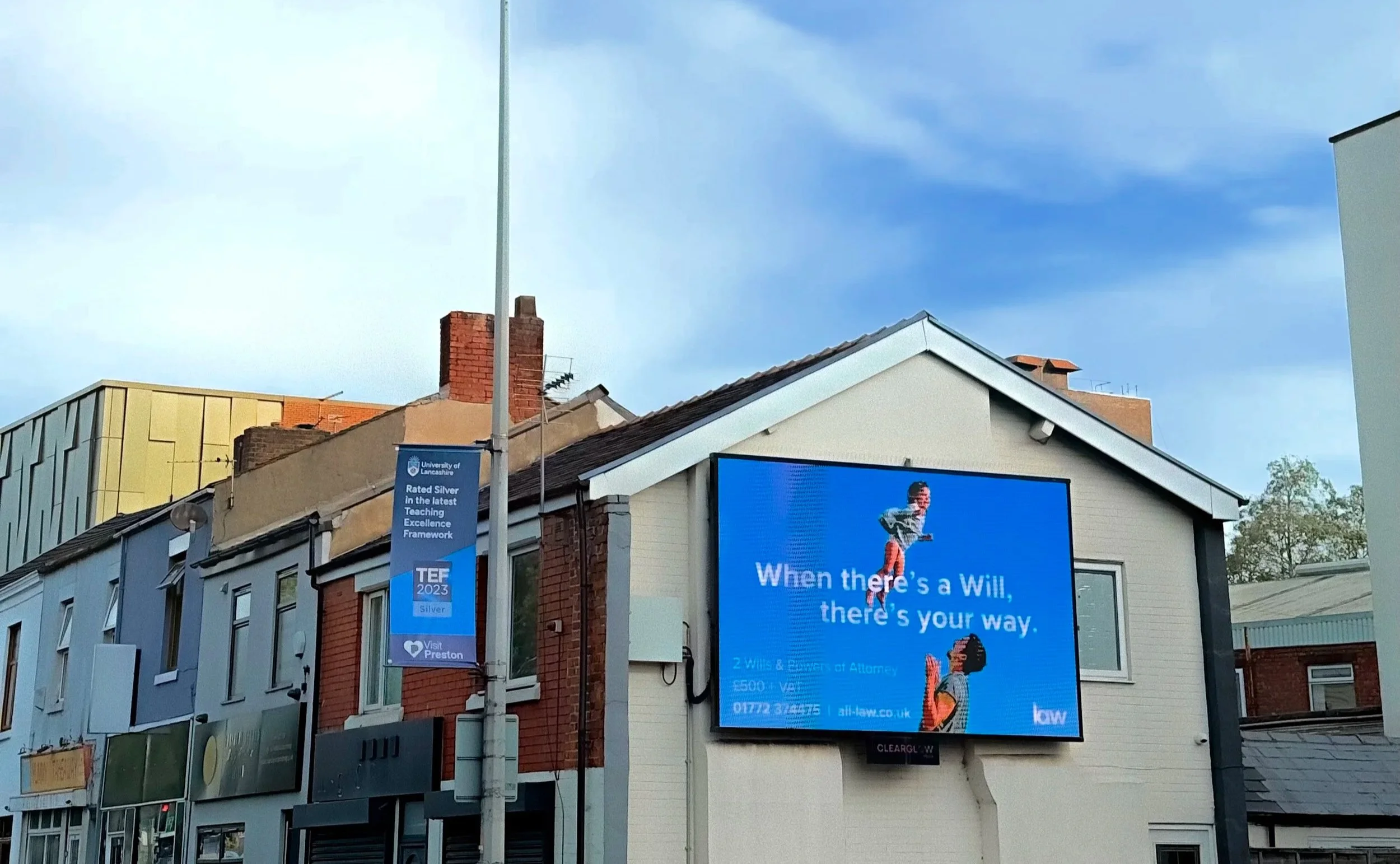
The billboard as it stands on London Road in Preston viewed by around 1m people every month.
The Copy: When wordplay works
"When there's a Will, there's your way" does double duty brilliantly. It's a fresh twist on a phrase everyone knows, but it also directly references the service whilst reinforcing the message that this is about your choices, your family, your future. We kept everything else refreshingly straightforward. The message tells you exactly what you're getting and what it costs. No "from £X" nonsense or hidden surprises. Just honest pricing that respects customer intelligence.
The Design: Sky's the limit
That brilliant blue background isn't just pretty; it's doing serious work. Blue suggests trust and reliability (crucial for legal services), but this particular shade feels optimistic rather than corporate. It's the colour of clear skies and endless possibilities, which perfectly supports our "future-focused" message. The white typography is bold enough to read from a moving car but doesn't shout. The layout gives the image and headline space to breathe, whilst the contact details sit clearly at the bottom where people expect to find them.
Why it stops traffic (In a good way)
This billboard succeeds because it flips the script entirely. Instead of making legal planning feel like homework, it makes it feel like an act of love. The image draws you in with its pure emotional warmth, the headline makes you smile with its clever wordplay, and the offer is so clear and fair that you actually consider picking up the phone. We've taken something people actively avoid thinking about and made it feel hopeful. That's the kind of creative challenge that makes this job worth doing.